500 word critical analysis of three fashion photographers
Pamela Hanson is one of my favourite fashion photographers. I chose Hanson because of how each fashion photograph she has taken has a style and how it can show female empowerment. Hanson has regularly taken pictures that are featured on magazine front covers such as InStyle, Bazaar and Glamour along with others. Her style of photography is to show female empowerment, even with the clothes they are wearing. Hanson takes pictures of women in bright clothing to encompass the status of the celebrities. Along with bright clothing, Hanson positions the model holding a prop or facing the camera and Hanson is able to use the cultivation theory to change the way an audience will see the photograph. They have influences because if she photographs a big star for an upcoming new movie with big interest over the world, fans will take the photograph and share it for days, and fans will enjoy the photograph and see it differently to someone who is just passing and takes a glance at it on a magazine front cover. The way a photograph is taken has the ability to change how audiences perceive it. Hanson uses different shots of the models, from full body shots to close ups which shows a range and can also change how the photos are perceived. A full body shot is more likely to be serious, with a stoic face whereas a close up would have a smile – however this is not always the case. There have been full body shots she has taken with a smile and a stoic headshot. Hanson’s photography also always shows the model’s natural beauty and skin textures.
Cass Bird is another one of my favourite fashion photographers. I chose Bird because I like how all of her photos aren’t the same and it shows the difference between each celebrity she photographs. Bird has taken photos for American Eagle, Zara and Calvin Klein along with some magazines. Bird’s photographs allow the celebrities to be comfortable in their own skin and Bird conveys that thoroughly through her photographs. Bird’s photographs can also show the celebrities having fun on the photoshoot. Bird also uses a range of locations – especially the streets to capture the feeling of the photoshoot and to allow the celebrities to be shown in another light. Along with shooting women, Bird also shoots men and children. Shooting in a range of locations can show how comfortable a celebrity is during the photoshoot and therefore could make the photography better. It also shows signs of wealth in what the celebrities are wearing and shows that if they are big celebrities that they can afford to wear big expensive brands and audiences are able to see the celebrities in refreshing ways, maybe in ways they haven’t been before. I also really like the way Bird contrasts colour photographs with black and white photographs.
Giampaolo Sgura is one of my favourite fashion photographers and i like his style of photography. Sgura has a certain style of photography for making sure the celebrity is styled correctly rather than staying in with the trends and so he likes the celebrity to be styled rather than what’s new in fashion. Sgura has shot for GQ and Vogue many times and he always has visually appealing photographs. Sgura shoots up close with celebrities and works with both men and women – using both colour and black and white to show the different fashion and style statements. Sgura has a way of making audiences see celebrities in a different way rather than just someone they see on screen. It can make fans of them support them even more and can make ore fans of celebrities due to the style of photography.
Images I want to emulate

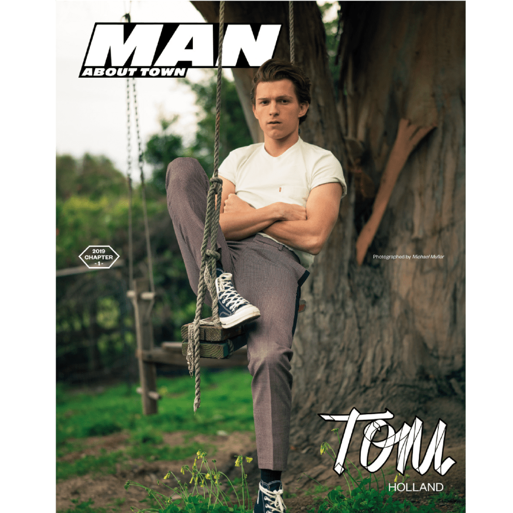
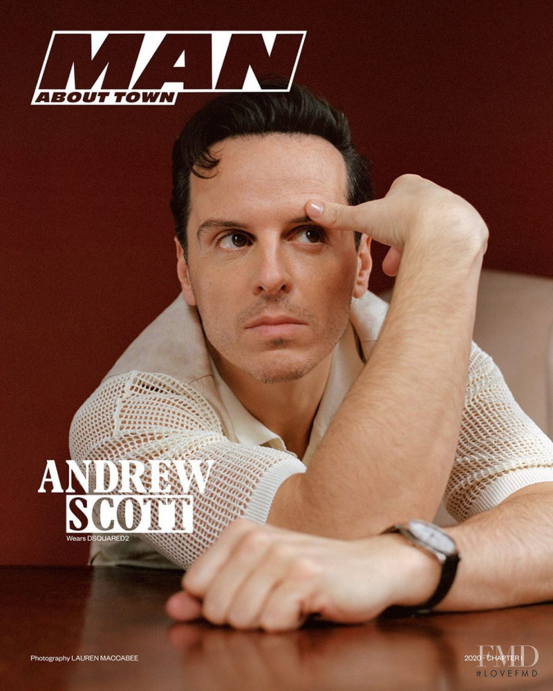
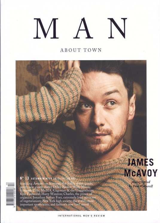
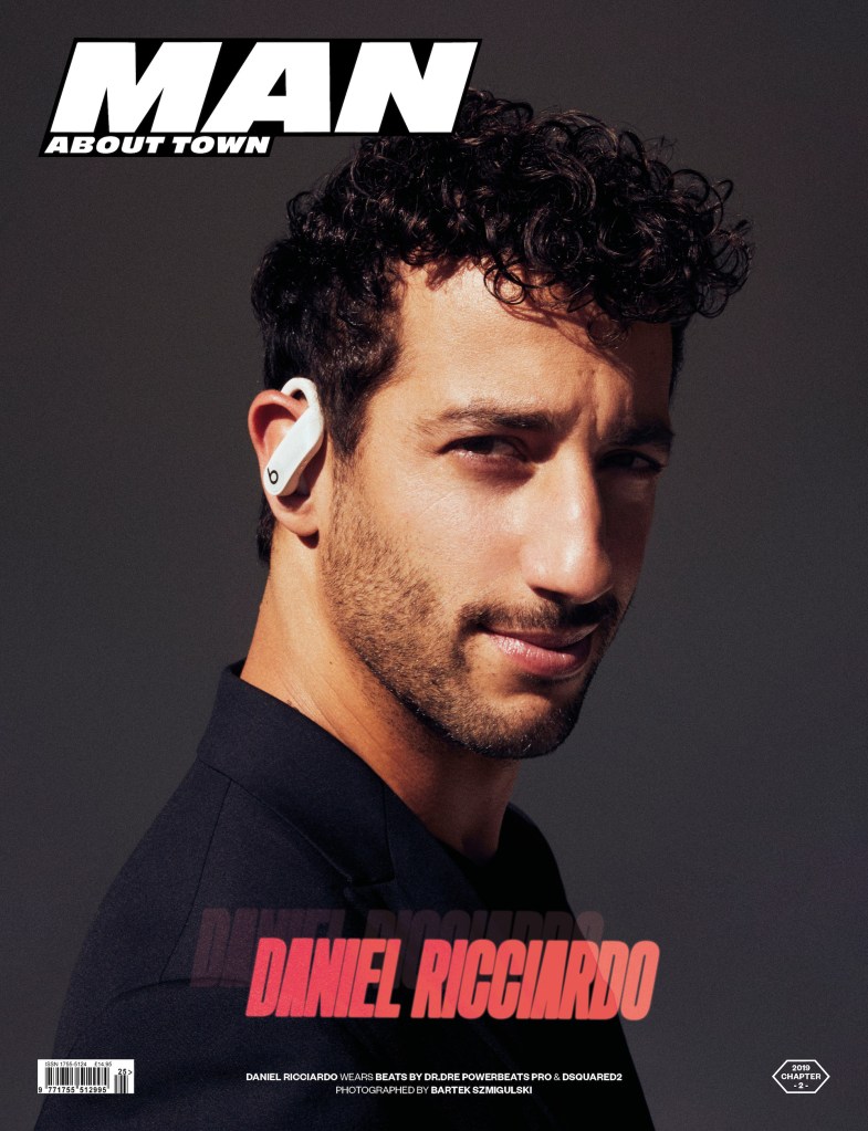
Man About Town (left to right): Tom Holland, Andrew Scott, James McAvoy and Daniel Riccardo.
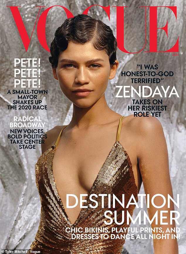
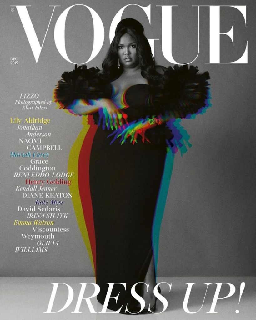
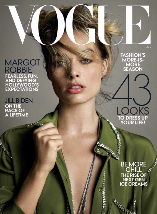
Vogue (left to right): Jodie Comer, Zendaya, Lizzo and Margot Robbie.
Three publications research
Men’s Journal
Men’s Journal is a monthly men’s lifestyle magazine which is focused on outdoor recreation and compromising editorials on the outdoors, environmental issues, health and fitness, style and fashion and gear.
Men’s Journal was founded by Jann Werner on April 13, 1992. On February 21, 2020, American Media announced the layoff of Men’s Journal’s entire New York editorial staff, totalling about 20 people. In doing so, the company also reduced the magazine’s frequency, from 10 issues a year to six.
The format of Men’s Journal is divided into three subsections. The first is notebook which encompasses the latest trends, products, destinations, style and design. The second is blueprint provides the latest science articles and expert advice on diet, fitness and exercise. The last subsection is gear lab which is a monthly buyer’s guide of tested and approved essentials: tech, tools and toys. Men’s Journal hires experts and professionals to examine the products and the best performing gear throughout the year get highlighted in the December issue, “Gear of the Year”.
The target audience for Men’s Journal is “active men” with an interest in actually participating in sports and other adventurous activities, not just watching or reading about them.
GQ
GQ is an international monthly men’s magazine which focuses on fashion, style, and culture for men, though articles on food, movies, fitness, sex, music, travel, sports, technology, and books are also featured.
GQ has 20 editions it produces for: Australia, Brazil, Britain, China, Espana, France, Germany, India, Italia, Japan, Korea, Middle East, Mexico, Portugal, South Africa, Thailand, Turkey, US and Russia.
Gentlemen’s Quarterly was launched in 1931 in the United States as Apparel Arts. It was a men’s fashion magazine for the clothing trade, aimed primarily at wholesale buyers and retail sellers. Initially it had a very limited print run and was aimed solely at industry insiders to enable them to give advice to their customers. Gentlemen’s Quarterly was re-branded as GQ in 1967. The rate of publication was increased from quarterly to monthly in 1970. In 2016, GQ launched the spinoff quarterly GQ Style.
The target audience is young adult males from the ages if 18-25 years old. The magazine is targeted at this type of audience because it has features inside which a stereotypical male would like.
Vogue
Vogue is an American monthly fashion and lifestyle magazine covering many topics including fashion, beauty, culture, living, and runway.
There are 23 international versions of Vogue including: Arabia, Australia, Brazil, Britain, China, Czechoslovakia, Espana, Germany, India, Italia, Japan, Korea, Mexico, Nederland, Paris, Polska, Portugal, Russia, Taiwan, Thailand, Turkey, Ukraine and US.
Vogue began as a weekly newspaper, first published based in New York City in 1892. British Vogue was the first international edition launched in 1916 while Vogue Italia has been called the top fashion magazine in the world.
The Vogue magazine is for a target audience of young women from 20 to 40 years, who are successful and beautiful and who wants to be aware of all the novelties of fashion and beauty.
Analyse three front covers
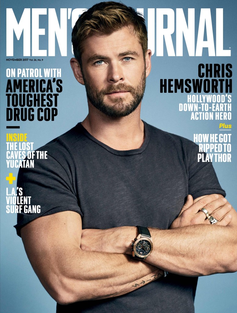
Men’s Journal – Sam Rockwell
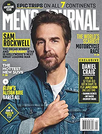
Sam Rockwell appeared on the cover of Men’s Journal April 2020 edition.
The front cover starts with the title. The title is used to show the name of the magazine this being ‘Men’s Journal’ but the middle covered by the model’s head. It’s a large text so that audiences can recognise the magazine. The masthead is in all white and a specific font; the same one that the Men’s Journal uses on their website. It also has been covered by the model’s head because that mean’s it’s easily recognised and popular.
The central image is an actor who many people may recognise but not necessarily know the name of. The actor is Oscar winning Sam Rockwell who is a ‘rising’ star despite being in 70+ films. The image is Rockwell photographed my Michael Schwartz in denim and a white shirt, placed on a grey background.
The cover lines talk about adventure and other celebrities who may be included in the magazine. For example it talks about ‘the world’s scariest motorcycle race’ and then underneath it – it shows a page to turn to if someone wanted to read about it. The cover lines also include ‘the hottest new SUVs’ and ‘Glow’s Alison Brie bears all’.
The main cover line starts with the actors name ‘Sam Rockwell’ in big letters before introducing him on the front cover. The main cover line is: ‘The Oscar winner and Jojo Rabbit star is Hollywood’s next leading man’. It shows how the actor has accolades and has been recognised in Hollywood’s biggest annual award season and also talks about a movie he has just stared in – Jojo Rabbit – which was a very much talked about film and also directs them to a film they can watch with the star in it just on the front cover.
The magazine front cover also has an ‘exclusive’ on the front cover. On this issue the exclusive is with star ‘Daniel Craig’. Daniel Craig is most notably known for playing ‘James Bond’ and it touches upon that in the exclusive box. This makes the audience interested in Daniel Craig want to know more and check out the exclusive in the magazine.
The issue is at the top of the magazine to show when it was. The issue for Men’s Journal was April 2020 and it is the ‘Adventure 2020’ issue. This allows consumers to know when it was released and can also help anyone find it online .
The barcode at the bottom of the magazine as it is one of the required necessities and it usually covers the date and the price. It doesn’t follow any of the connotations as it is not related to anything inside the magazine.
Levi-Strauss theory of binary opposites is apparent in the magazine cover to do with the colours. There are texts in yellow which opposes the blue that the actor is wearing. Neale’s genre theory is here because it covers many different genres and ideologies within the magazine – as a lifestyle magazine being the adventure issue.
GQ Style – Tom Holland
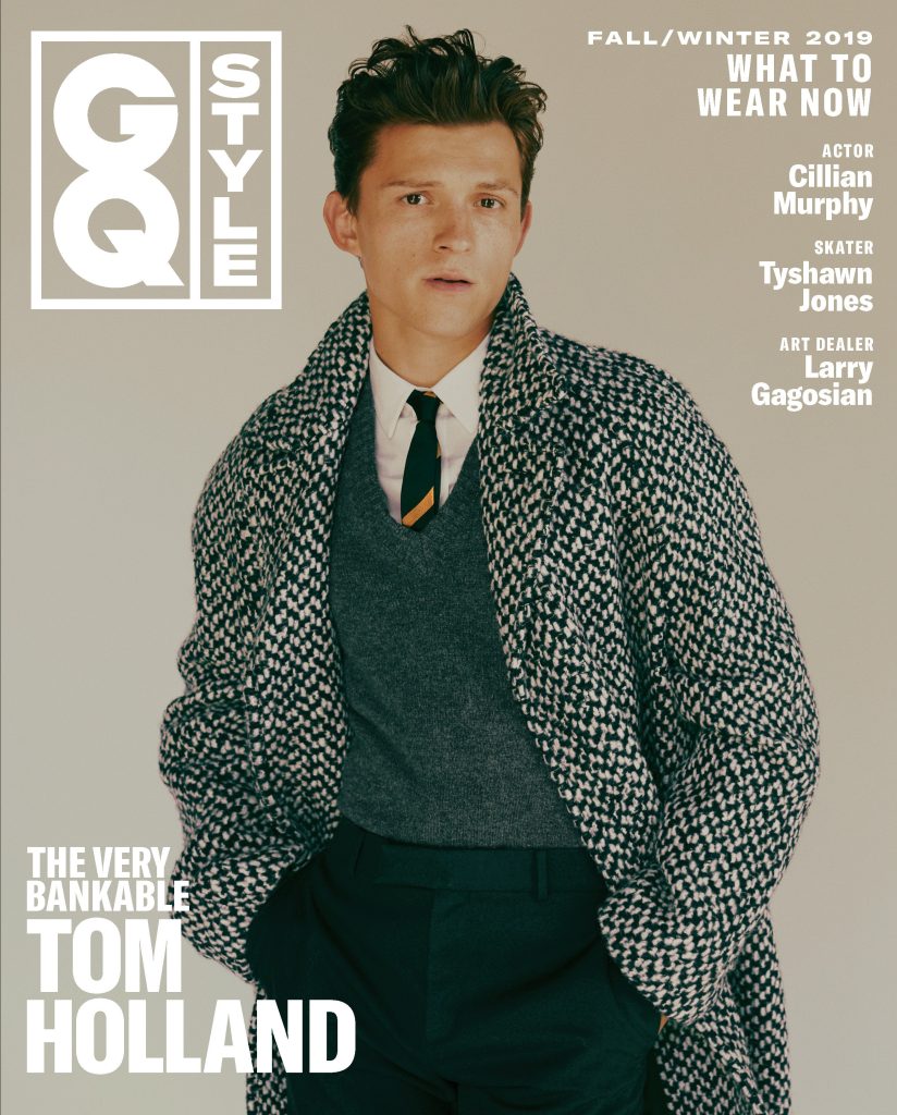
Tom Holland appeared on the cover of GQ Style in September 2019.
The masthead of the magazine is in the left hand corner. Since this magazine is a spinoff of GQ it has a different logo to the GQ magazine. The masthead is a square box split into two rectangles: each holding one word. It is separate from the magazine as a whole so that an audience can see the name of the magazine.
The central image is of one of the most known actors in the world right now, Tom Holland. The image is of him wearing a coat, sweater, shirt, pants and tie photographed by Fanny Latour-Lambert. The actor is placed in front of a grey background to emphasise the clothing he is wearing. Holland is also wearing very expensive clothing which gives the clothing brand advertisement.
The cover lines on the front of the magazine start with ‘what to wear now’ which connotes the ideologies that it is a fashion magazine and it will show off the latest styles and trends inside. The cover lines also provide an insight on who else is in the magazine ‘actor Cillian Murphy’, ‘skater Tyshawn Jones’ and ‘art dealer Larry Gagosian’.
The main cover line introduces the cover star as ‘the very bankable Tom Holland’. This can also show that Holland is the main star of the magazine and it uses the words ‘bankable’ to show that he is successful.
The issue is from the fall/winter 2019 as it allows audiences to be able to find specific magazines they want.
Barthez use of semiotics is used in the magazine front cover within the clothing as it can portray how wealthy the actor on the front is and can also show how successful he is after acquiring the money. Neale’s use of genre is also used as it is a style magazine and talks about the latest styles.
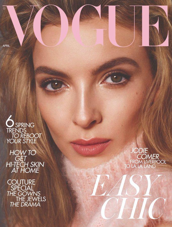
Vogue – Jodie Comer

Jodie Comer appeared on the cover of British Vogue in April 2020.
The masthead is at the top and stretches all the way from left to right and is pulled forward so it is not behind the model’s head. The colour of the masthead also reflects the central image. It is Vogue’s font that is easily recognisable.
The central image is actress Jodie Comer. The image is centralised as a close up and was photographed by Stephen Meisel. Comer is wearing a pink pullover or turtleneck which adds to the colour pink on the masthead.
The cover lines start on the left with ‘6 spring trends to reboot your style’, ‘how to get hi-tech skin at home’, and ‘couture special the gowns the jewels the drama’. These are all things that are featured in the magazine that audiences can find. It also has the cover line introducing the actress: ‘Jodie Comer from Liverpool to La La Land’, and it isn’t the biggest cover line but it is also above the cover line so it is easy to be read.
The main cover line is ‘easy chic’ as the magazine will focus on chic outfits and styles to show off in the spring. The main cover line is also written in the same font as the masthead to draw attention to it.
The issue is written very small in the left hand corner with the word ‘April’ to show that it is from that month.
Hearst and Bauer Publications research
Bauer Publications have many different magazine brands. Some are well known such as Empire and Heat while others are not so known such as Steam Railway and Spirit & Destiny.
Bauer reaches over 22 million UK adults, with all the publications in sales in both digital and print.
Bauer Media’s network of 107 brands target disparate audiences from under 18s to over 65s which means we are uniquely placed to provide engaging and perceptive insight on all UK audiences.
Hearst Magazines publishes over 300 editions and 240 websites around the world. Some of the brands are Cosmopolitan, Elle, Esquire and Bazaar. These are well known magazine brands.
Hearst is for a range of both men and women and collects information on its audience and demographics to see what gender are buying more of what magazine. For example the Cosmopolitan ratio for men to women buying it is 30:70 where as for Car & Driver the male to female ratio is 72:28.
Double page spread analysis
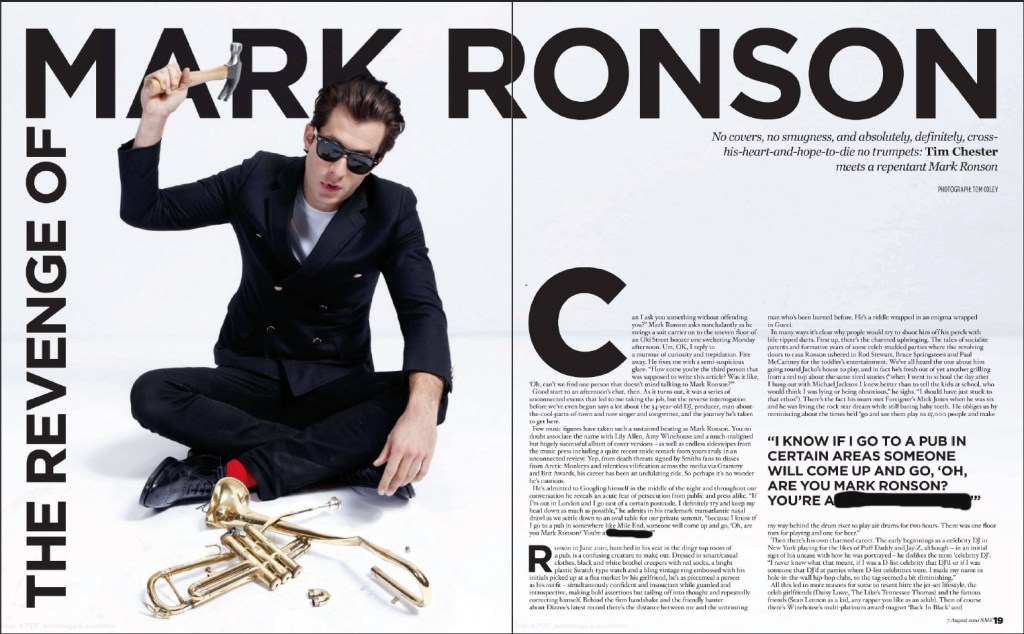
The main image of the double page spread is a picture of Mark Ronson sat on the floor, in a semi formal look with an instrument in front of him, which looks like a trumpet. In the image, Ronson is also holding a hammer in the air and looks to be driving that into the trumpet, which can signify that Ronson doesn’t like the trombone or he is trying to destroy that type of instrument. Ronson is wearing his signature sunglasses, which he wears in music videos he features in the background contrast with the clothes Ronson is wearing – the black clothes contrasting the white background. This is the main image as the audience / readers attention is immediately brought to this so they can have a look at the image, that portrays music being destroyed an this could be what it’s pointing at. It is trying to show how music is being destroyed by people and the producers and / or the artists and that’s how some people feel about music.
The musicians name: Mark Ronson, is in capital letters and big letters at the top of the double page spread so that the readers know who they’re reading the spread about. It’s big so it brings attention to who the piece is about and if readers are just flicking through the magazine they can se the double page spread about the musician.
On the side of the first page of the double page spread, there is text that is to be read sideways – turning the page vertical to read it. It is connected to the big title of ‘Mark Ronson’ however it is in a slightly smaller font to the big text of his name. This because it is less important than the celebrity name, but it is still the title so it works well.
There is a quote on the double page spread is to entice the audience and get them to read the whole article. The quote can stand out on it’s own but the audiences / reader should want to know more about what is being said in the article.
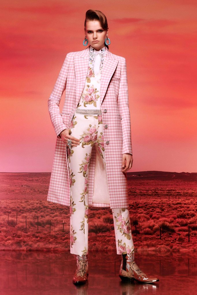
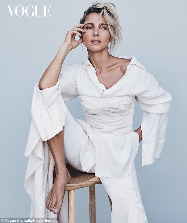
Fashion Images
Target audience research
18-34 year olds have a harder approach to get to read magazines so there needs to be some promotion on social media. Most on the younger side will see the magazine through promotion on social medias – whereas the older side will see it out shopping and it’ll catch their attention.
However it will only catch attention if the magazine front cover is appealing or has somebody on the front that the target audience wants to read it for.
Social media is a big influence on buying magazines because if they can be published online, most people would rather read it online than have it as a physical copy.
The main steam audience would have a more readers in the print publications when they pick it up and read it rather than reading it online.
